Ideas3 min read
Green or red: the case for a two-color status
Why UpWatch gives every update just two possible states, what belongs in a red, and how to write updates people can read in half a second.
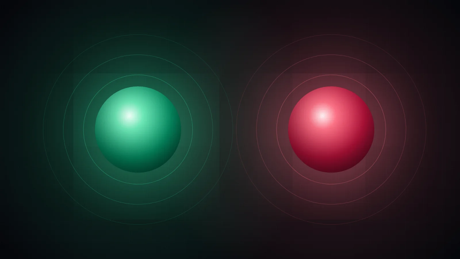
When we tell people that every UpWatch update is either green or red, the first reaction is often: only two? What about "mostly fine"? What about "running late but okay"?
It's a fair question. The short answer is that two colors aren't a limitation we tolerate. They're the whole idea.
Ambiguity is expensive
Think about the last time you got a "yeah fine" from someone you were worried about. You probably read it twice. Was that a relaxed "fine" or a tired "fine"? Should you call?
Free text invites interpretation, and interpretation takes attention. Multiply that by a family, a team or a group of friends, and a simple status check becomes a small daily reading exercise.
A color doesn't need interpreting. Green is green. You see it in your notifications, on the lock screen, in a list of five alarms, and you know. The decision ("do I need to do anything?") is made before you've read a word.
Why not three colors? Or five?
A middle state sounds helpful. Amber for "a bit off". In practice, a third option tends to become the default whenever someone isn't sure, and recipients end up reading every message again to work out what amber means this time.
Two states force a useful question on the sender: does someone need to pay attention to this? If yes, it's red. If not, it's green, and any nuance goes in the message.
That keeps the color reliable. A red should make recipients look up, every time. If reds become routine, people learn to ignore them, and the most valuable signal in the app turns into noise.
What belongs in a red
Red means "this needs a look". Some good examples:
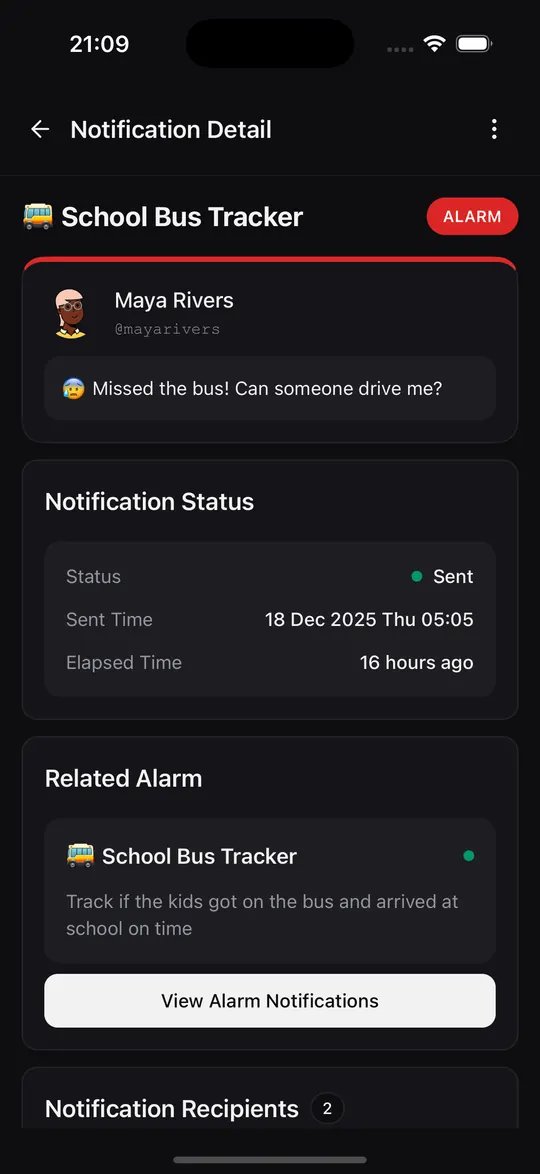
- "Missed the bus. Can someone drive me?"
- "Blocked on API keys, need a hand before tomorrow."
- "Shift is running two hours over."
- "Didn't make it to the gym today."
And some things that should usually stay green, with a note:
- "Running ten minutes late, all good."
- "Changed the plan, eating at Mia's."
- "Tired, but done for the day."
Writing updates people can read in half a second
The color carries the main message. The note is the detail. A few habits make notes far more useful:
Lead with the fact. "At school" beats "Hey! So the bus was a bit late but we're here now".
Keep it to one line. Notes appear in notifications, so the first few words matter most.
Use the alarm's context. You don't need to repeat "school run" in a school run alarm. The alarm name is already in the notification title.
Add location only when it helps. A location on "Arrived at the venue" is useful. On "Finished the report" it's noise. It's optional for every single update, so use it with intent.
Reading a whole week at once
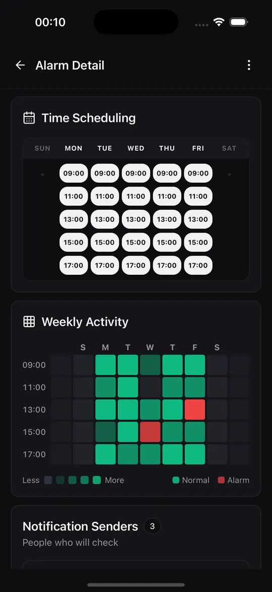
Two colors pay off most when you look back. In an alarm's history every update is a colored entry tied to its check time, so patterns jump out: the Thursday afternoon red, the morning that went quiet, the streak of greens after a new routine started.
On Premium and Pro, the activity heatmap condenses this further into a grid of days and times. You can read a week of routines in about the time it takes to read this sentence.
Quiet by design
Two colors also make it easy to decide what deserves your attention right now. If an alarm is busy, you can set its notification preference to Only alarms. The greens are still recorded and visible in the history, but only reds make your phone buzz.
The sounds help too. Reminders, normal updates and alerts each have their own sound, so you can tell what happened without looking at the screen.
The point of fewer choices
Every option you give a sender is a decision they have to make at the moment they're busiest. Every state you give a recipient is something they have to interpret. Two colors keep both sides fast.
Green: nothing to do. Red: take a look. Everything else is detail, and detail can wait for the note.
Try it with your people
Create your first group alarm in under a minute. Free to start.